


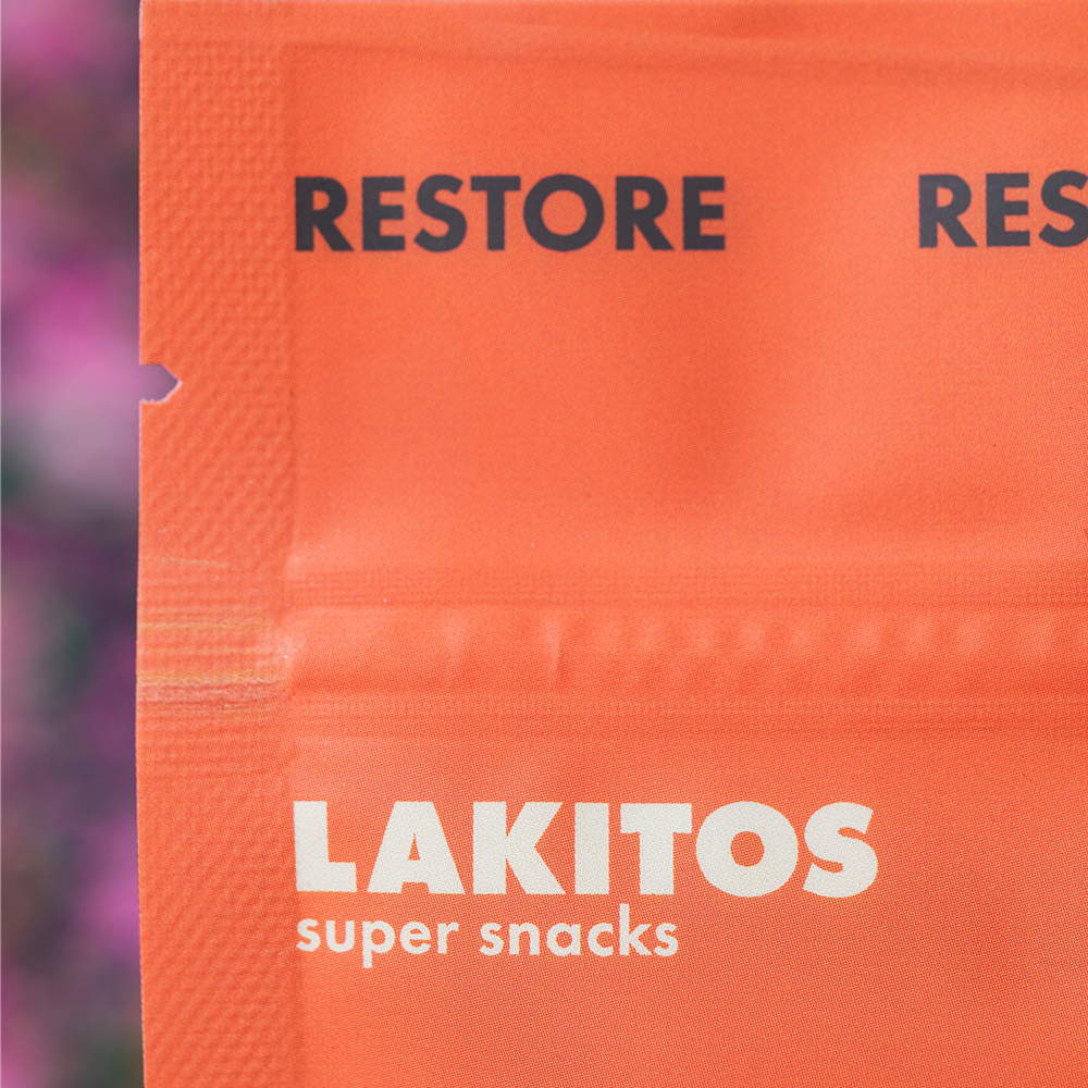
LAKITOS
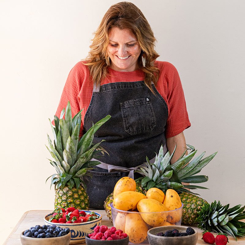
For years, Lakitos’ founder Mandy created dehydrated fruit strips from her kitchen for her friends. In 2023 she decided to take it to market and needed fresh branding for the product launch.
-
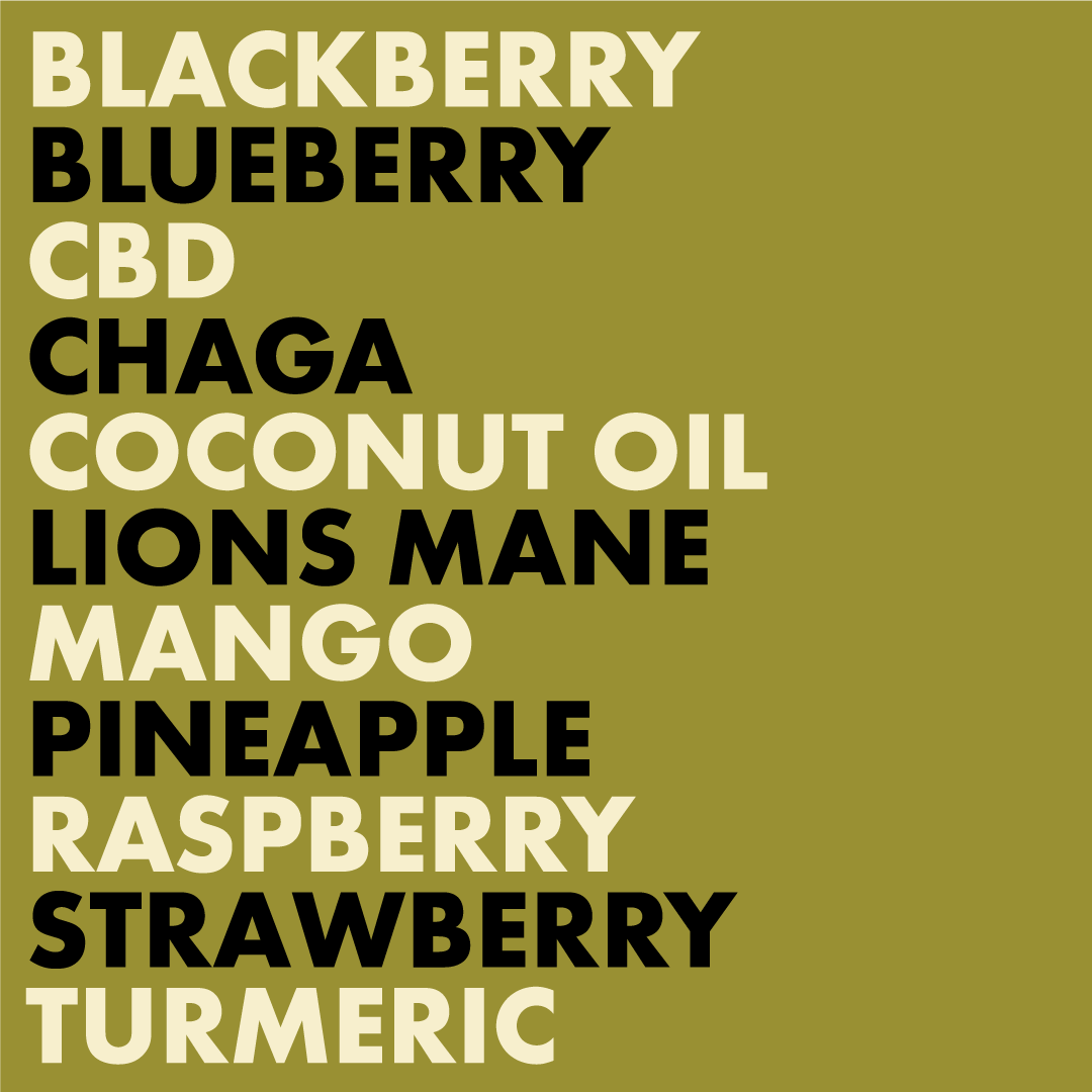
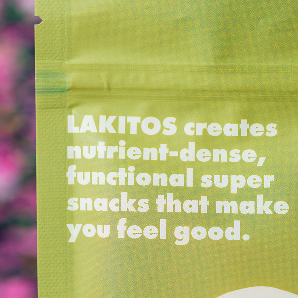
Lakitos’ purpose is to provide an understanding of how different ingredients from around the world can serve as tools to fulfil a specific need or improve quality of life. Lakitos celebrates that nature has everything we need to not only survive but thrive!
-
☞ Naming
☞ Brand Strategy
☞ Logo Design
☞ Visual Identity
☞ Verbal Identity
☞ Art Direction
☞ Packaging Design
☞ Social Content
☞ Photography -
☞ Shava Cueva Photography
-
Working with Jess was truly a highlight of my last year. From the start, her tools and thoughtful assessments allowed us to capture so many ideas and elements that without, would have never made it into the overall brand. I can genuinely say every part of this process never felt like work, but a total joy and absolute fun! Jess is talented, patient, and she has totally nailed how to do what she does. I am so pleased with how my brand has turned out and I owe so much of it to Jess. Eternally grateful and satisfied customer!
Project Objectives
Lakitos wanted to generate awareness about a new brand in town, educate consumers about functional ingredients and evoke feelings of nostalgia and fun.
Lakitos
(Tiny lakes)
The name “Lakitos” is a Spanglish word we created together to honour both the brand and Mexico, where the Lakitos was born. To Mandy, lakes are a powerful symbol, representing superfoods such as spirulina, an incredibly healthy edible algae found on the surface of lakes.

Concept Development
After conducting research and developing the brand strategy, concept development began.
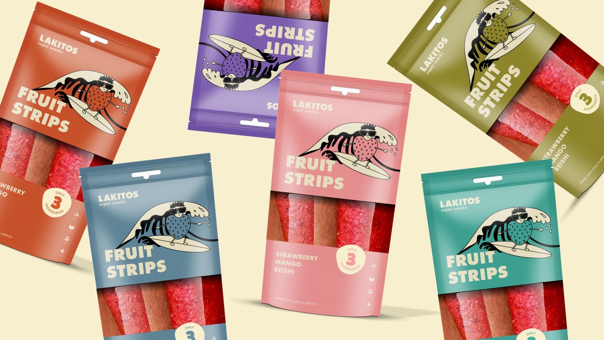
The first snack of the Lakitos’ product line was “fruit strips”, based on a childhood favourite (the fruit rollup). I explored themes of nostalgia by introducing a retro-inspired colour palette for Concept A. Concept B leaned into the idea of fun, leading with characters in a minimal layout. We merged elements of the two initial concepts to create the final brand look and feel.
Minimal
👌
Cool without trying hard
👌
Nostalgic
👌
Minimal 👌 Cool without trying hard 👌 Nostalgic 👌
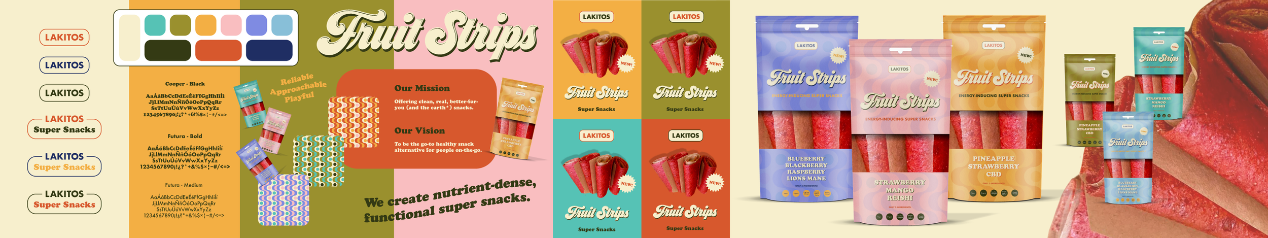
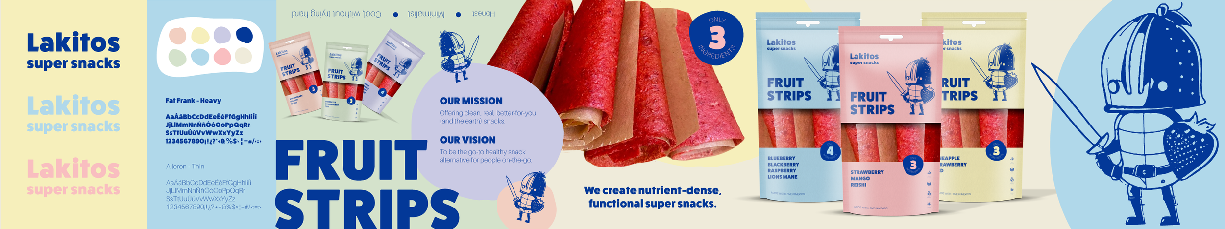
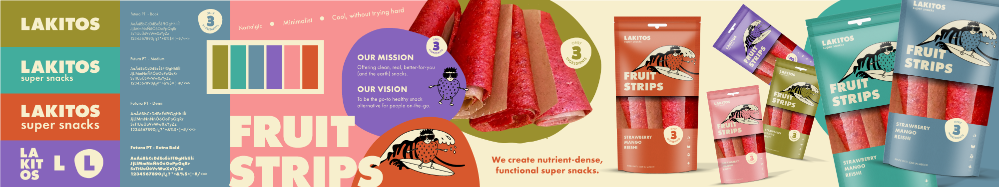
Brand Identity
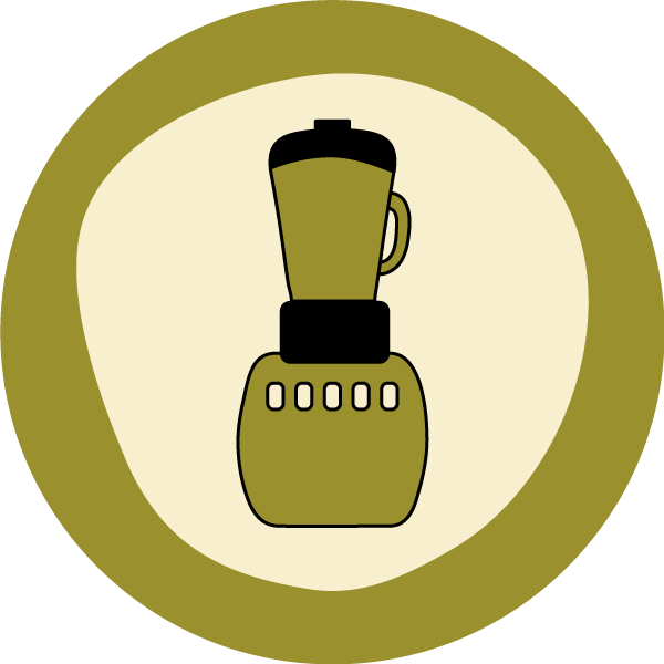
The visual identity rollout included a clean, simple logo to complement the colour-and-character-first branding.


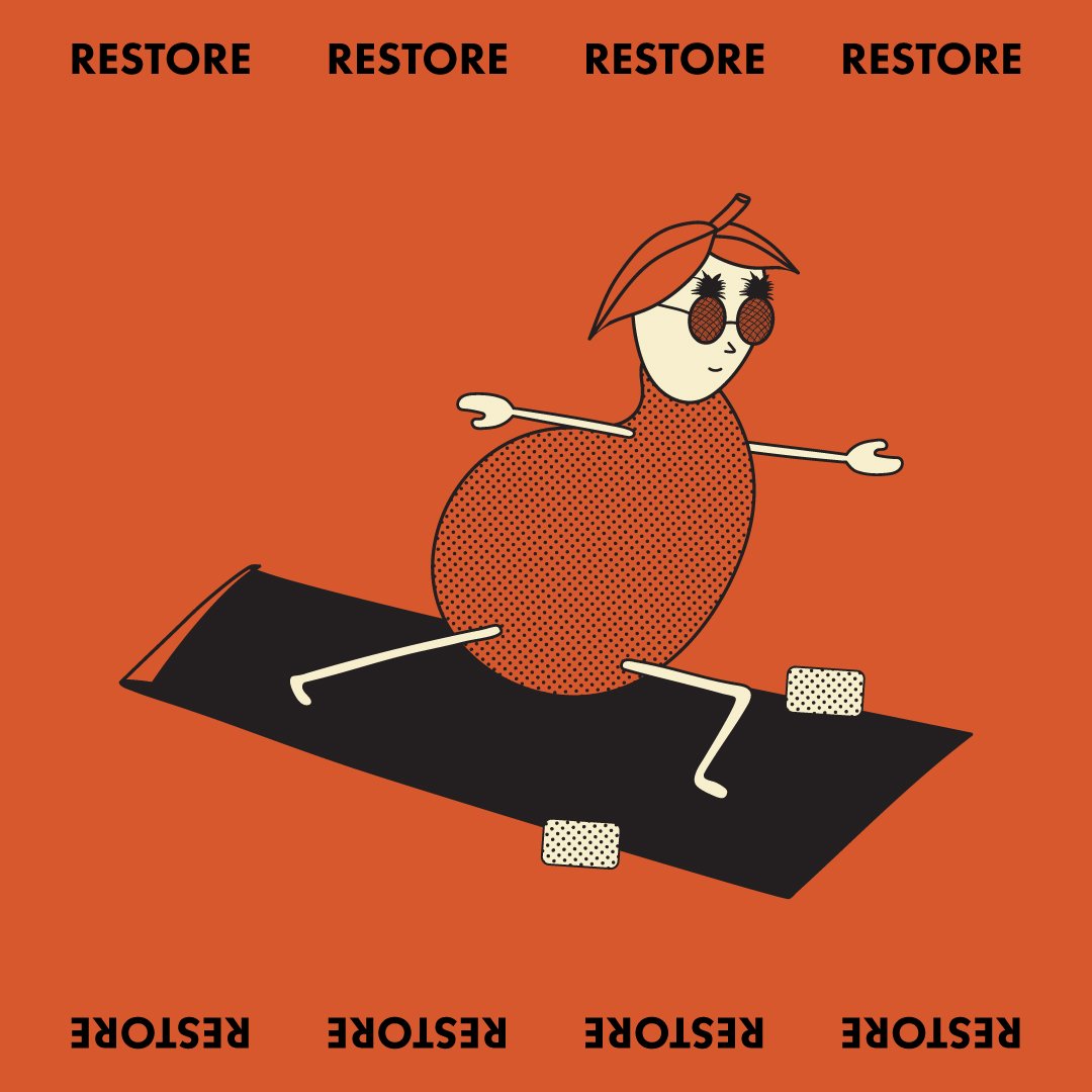
Illustrations
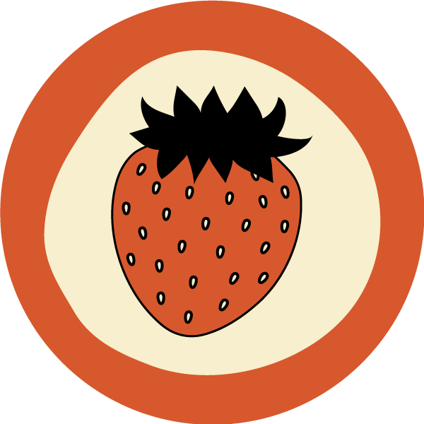
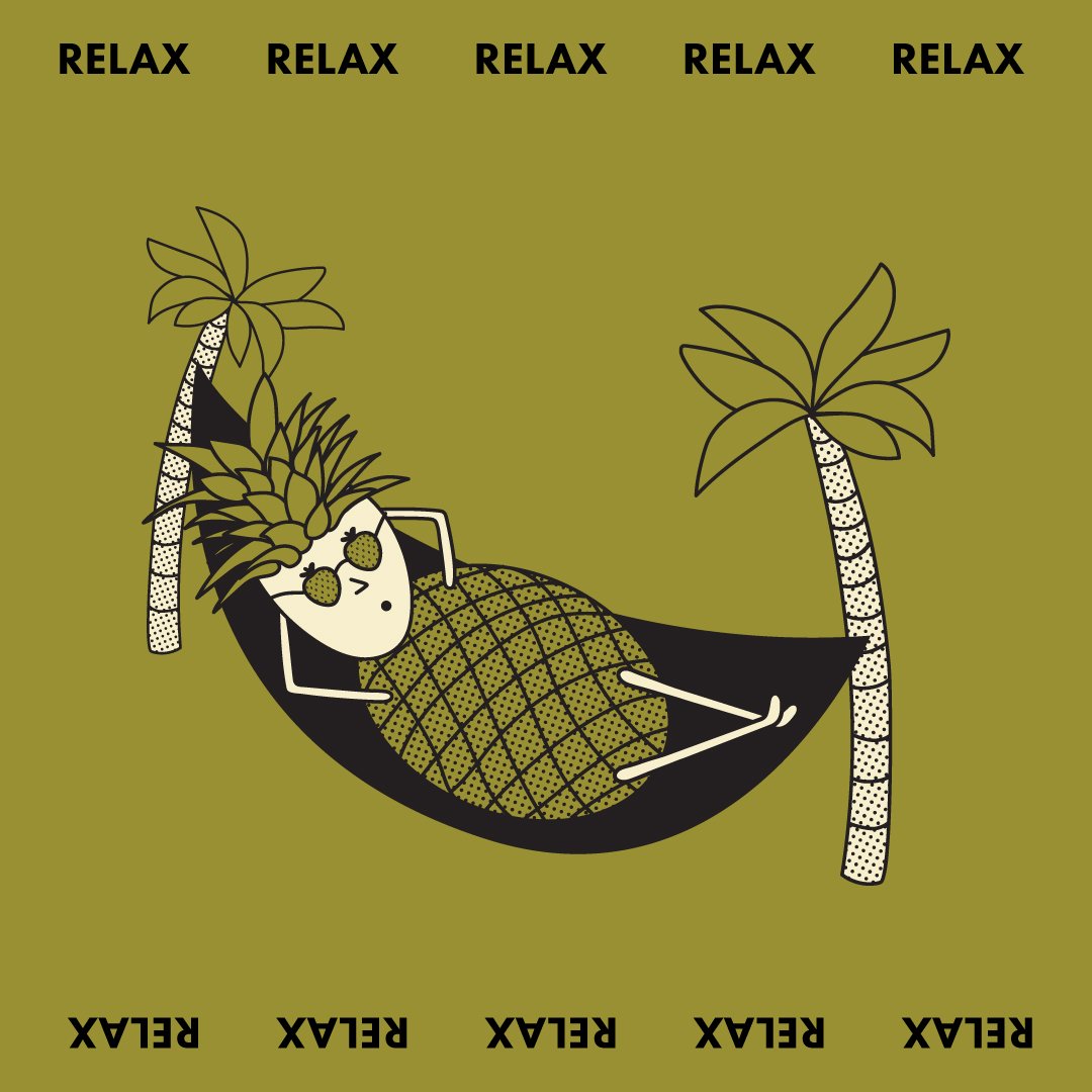
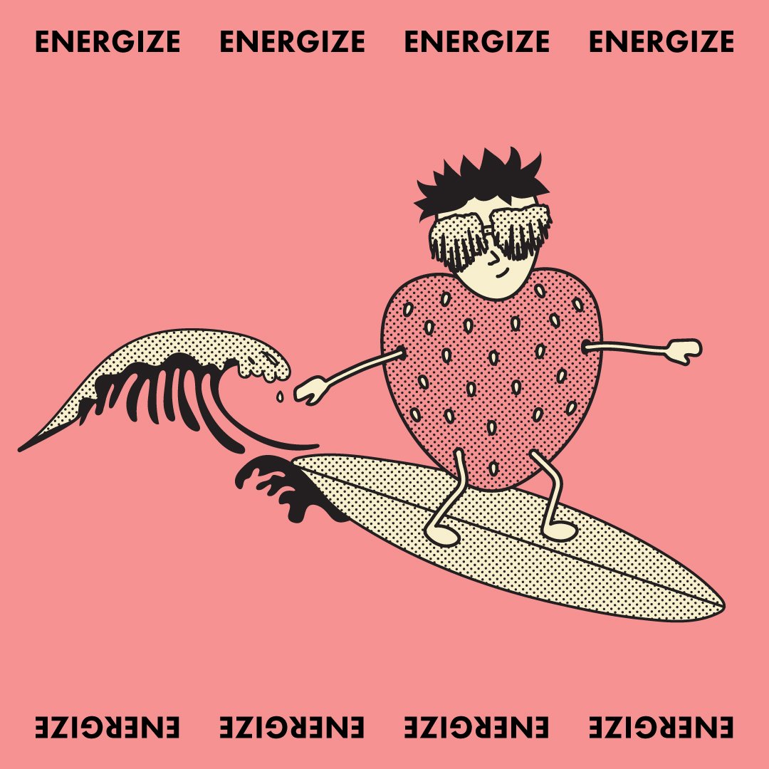
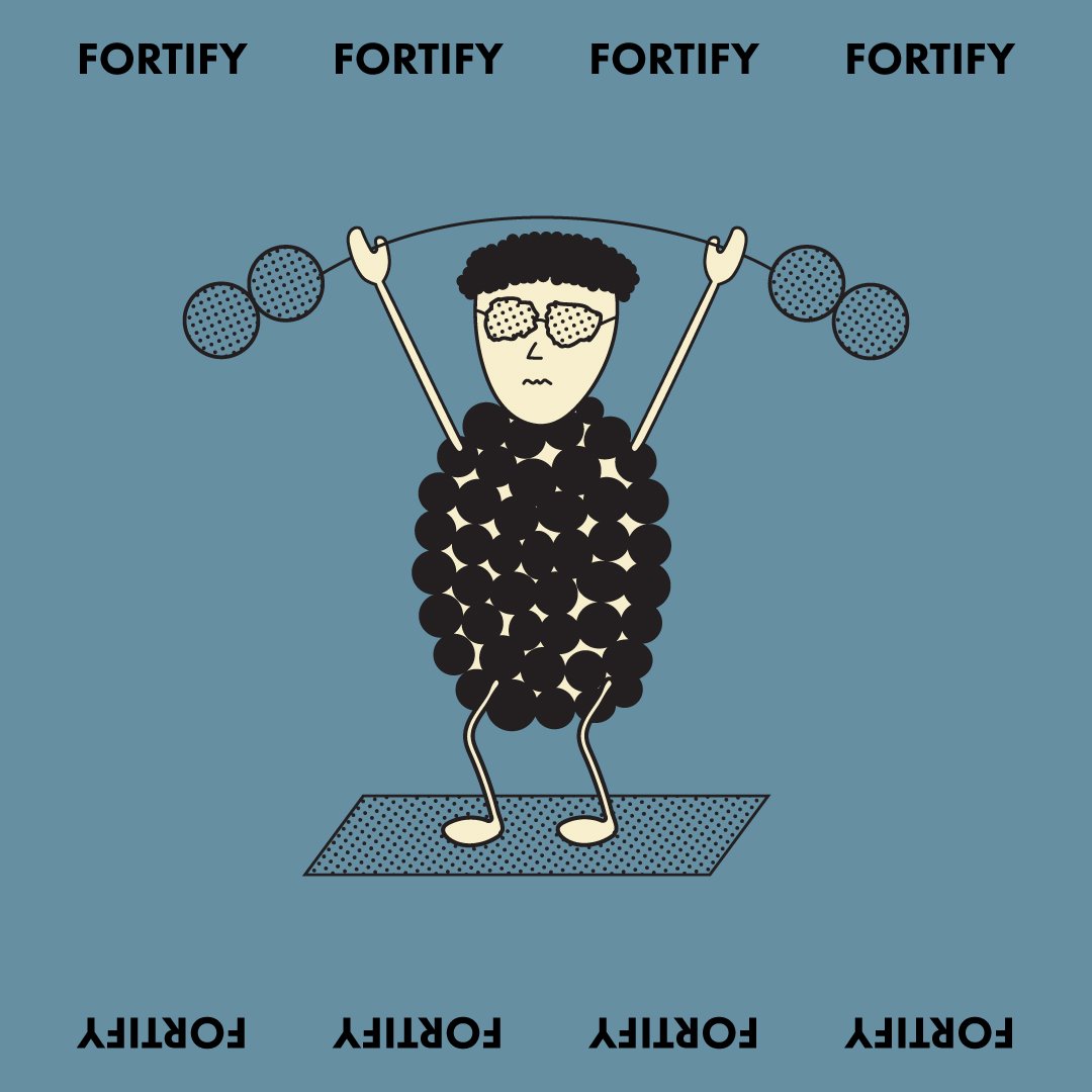
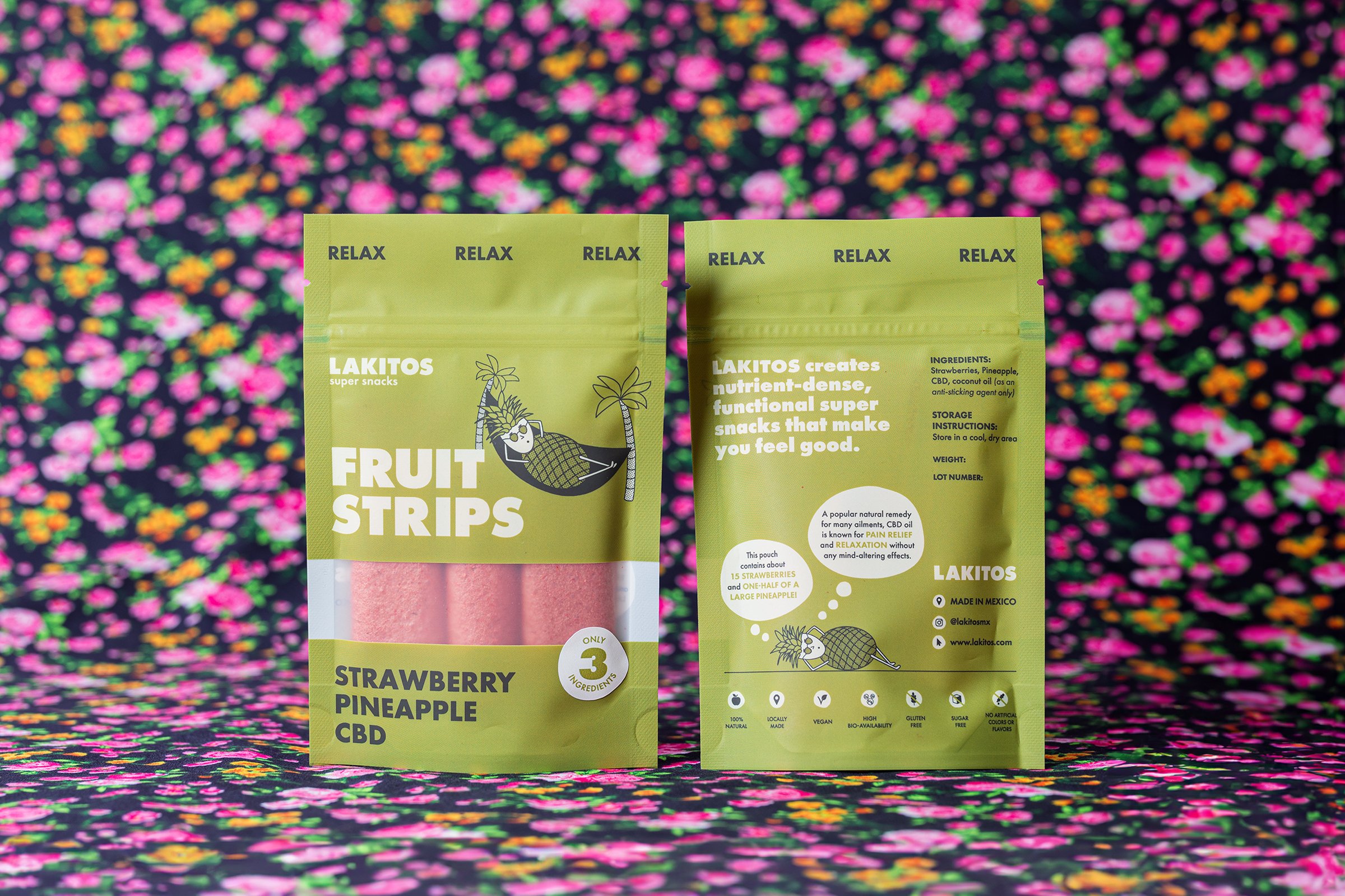
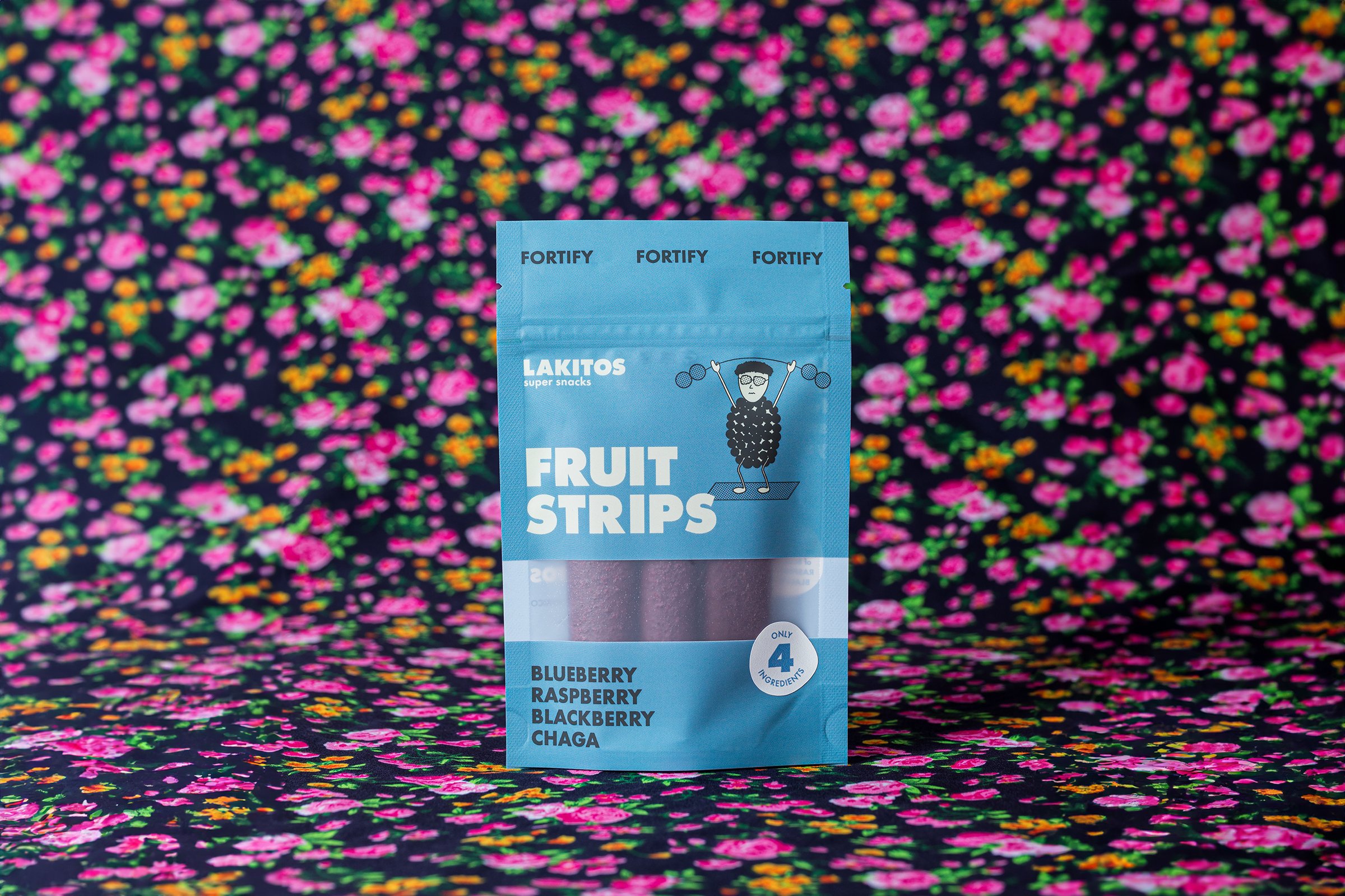
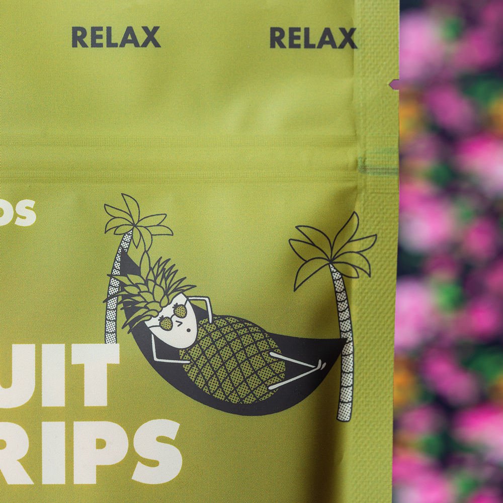
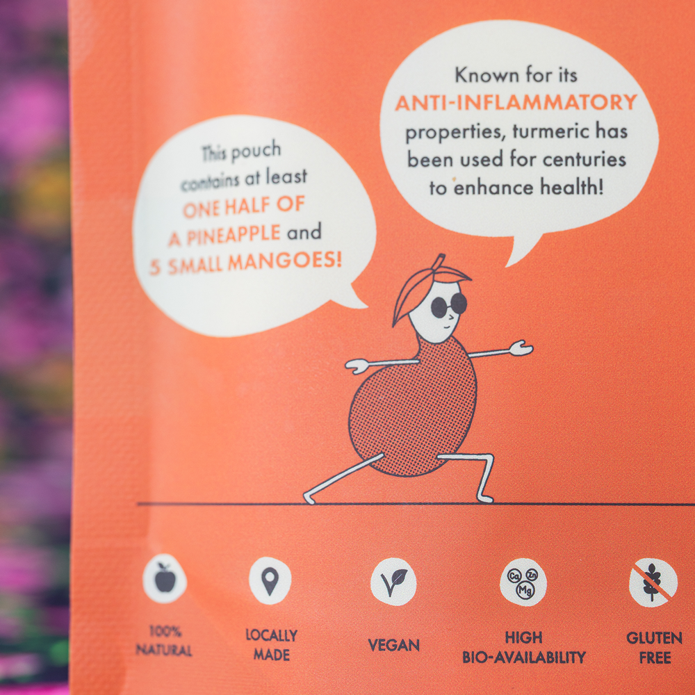
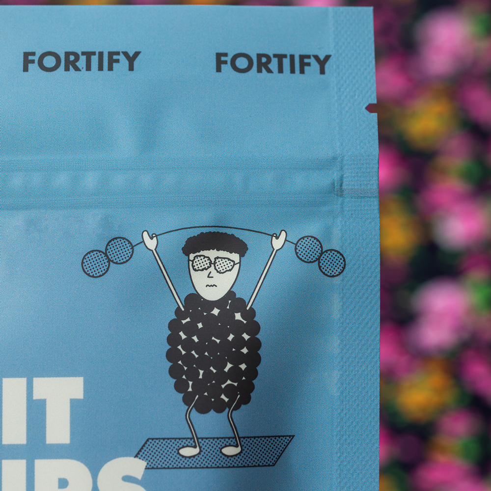
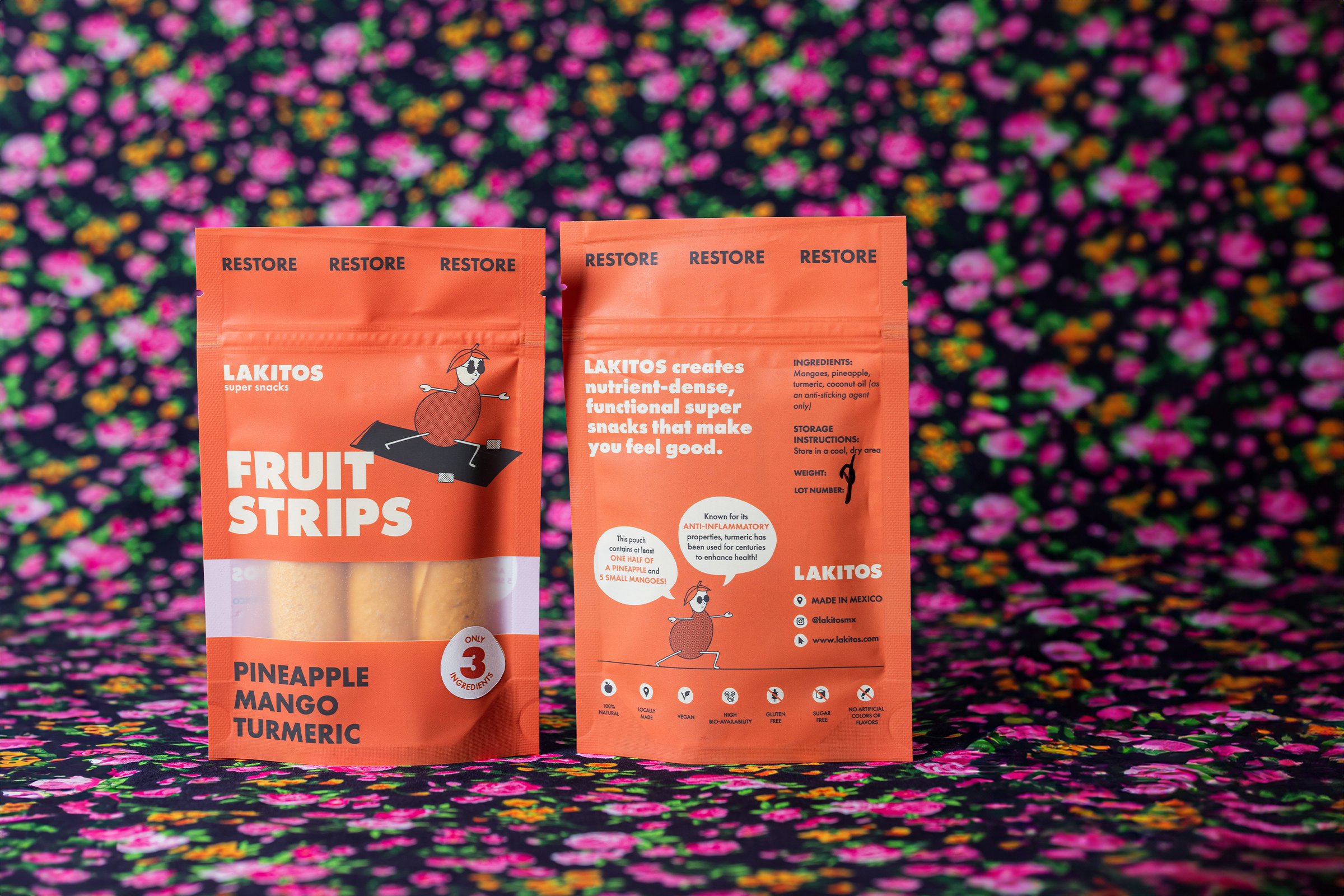
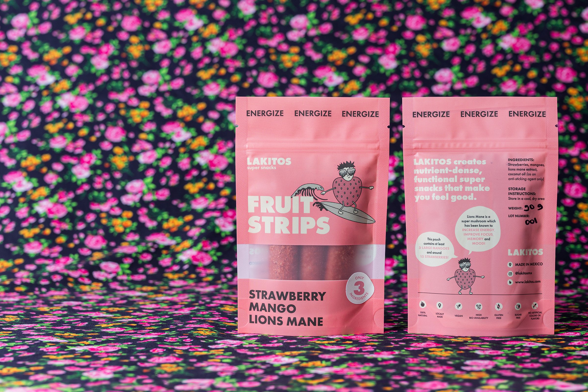
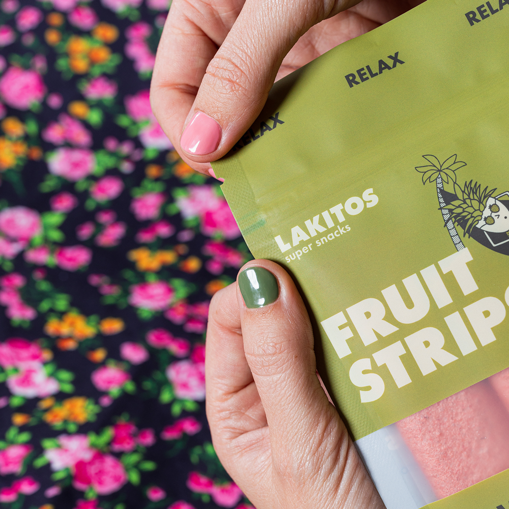
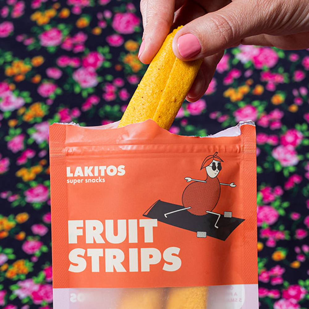
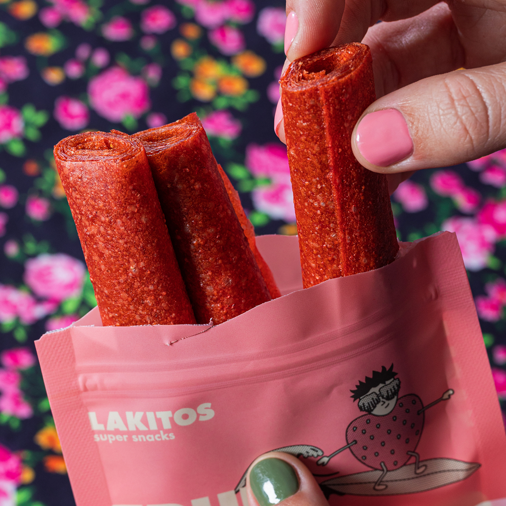
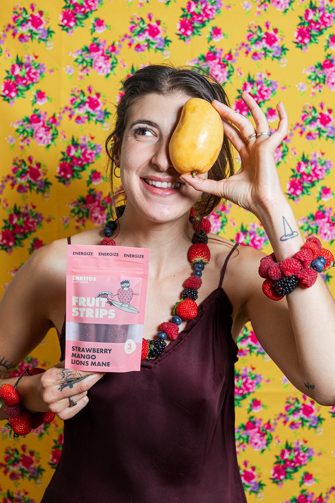
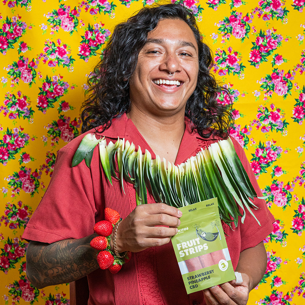
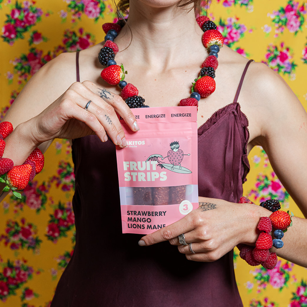
Illustrations were created for the first four products within the Lakitos fruit strips range. Four fruit characters were created from the ingredients of each product, doing activities based on the benefits of each product. The range characters included: a surfing strawberry with lions mane glasses for the Energize fruit strips, a pineapple in a hammock wearing strawberry glasses for Relax, a yogi mango with pineapple glasses for Restore and a bulking berry with chaga glasses for Fortify.
In addition, custom illustrated icons were created for the brands’ Instagram Highlights.


Content Creation


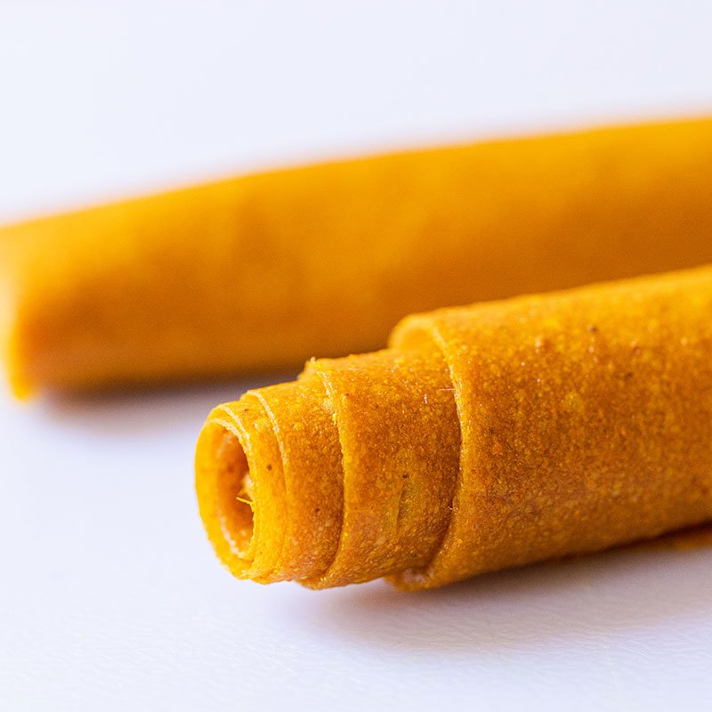
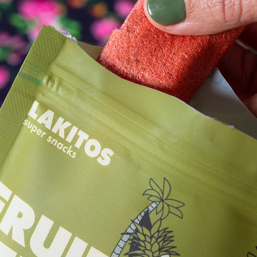
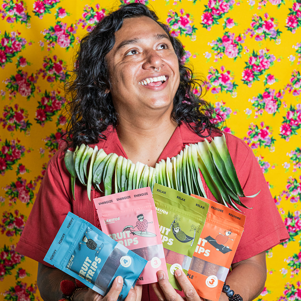
Packaging
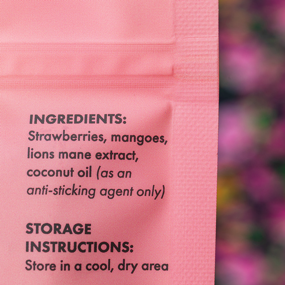
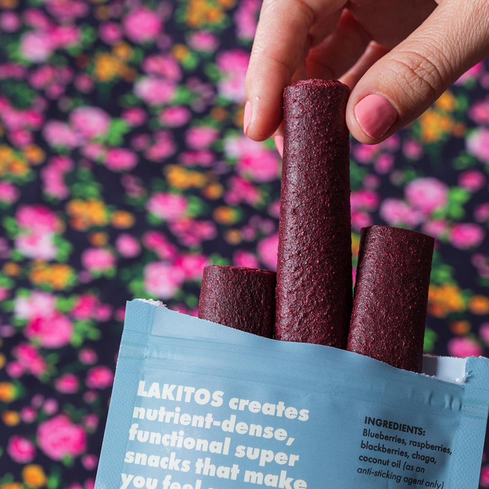
Four standing resealable bags were designed in their respective bold colours. The front of the bag was kept clean to showcase the product from the window, with the majority of the information included on the back of the bag along with educational points about the superfood ingredients.

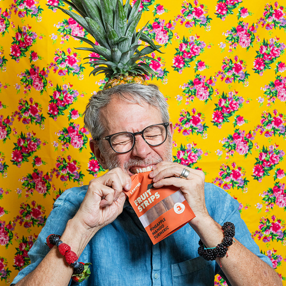
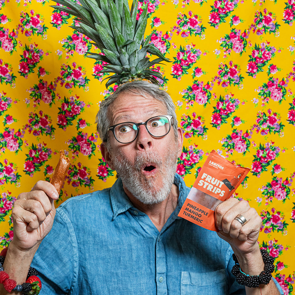
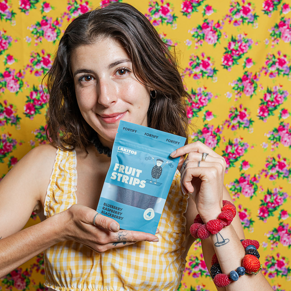
Product Photography
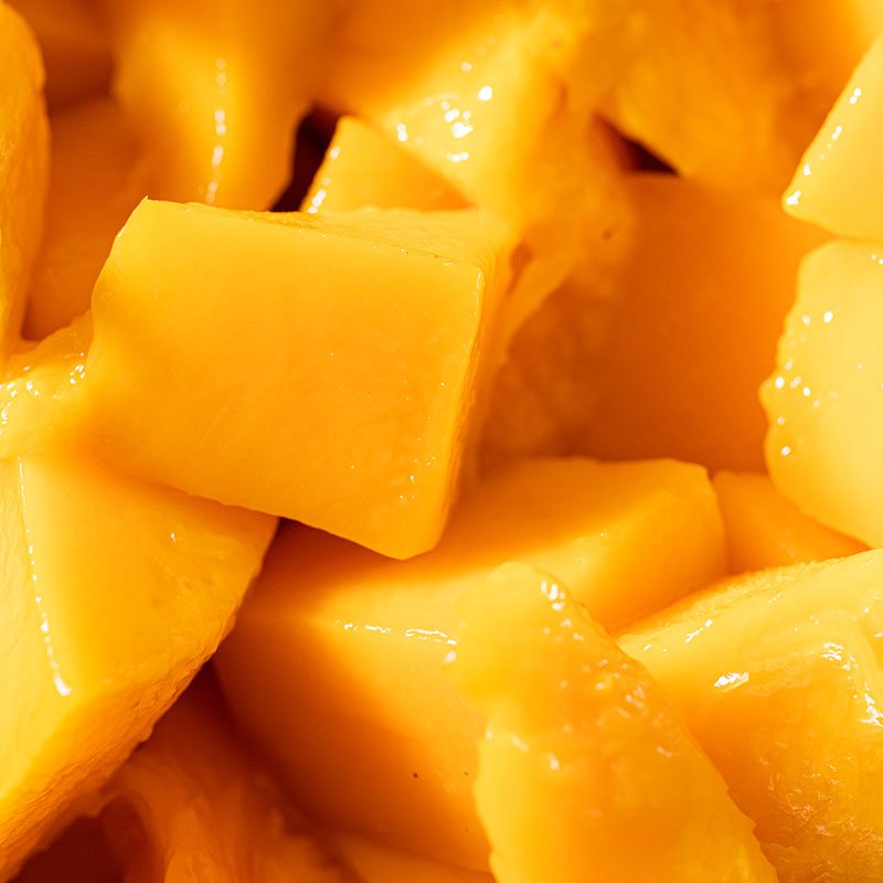
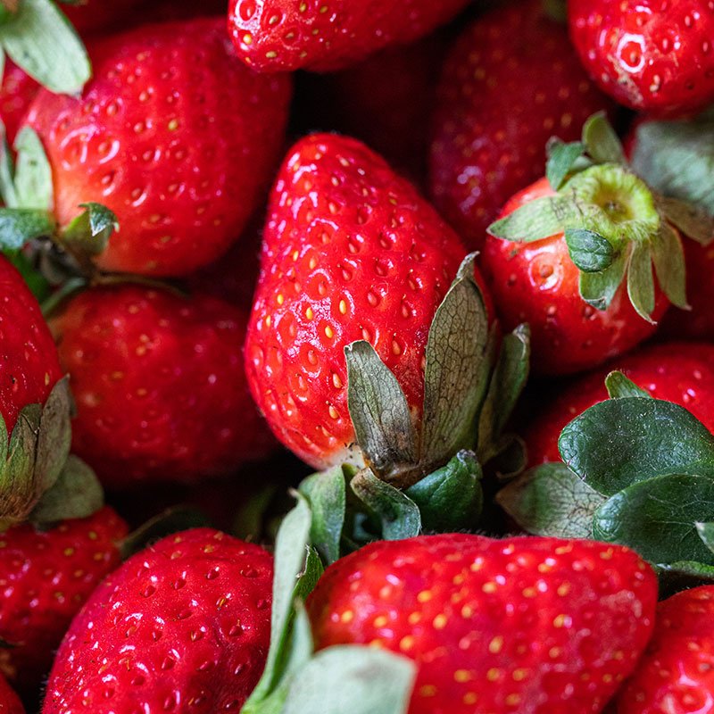
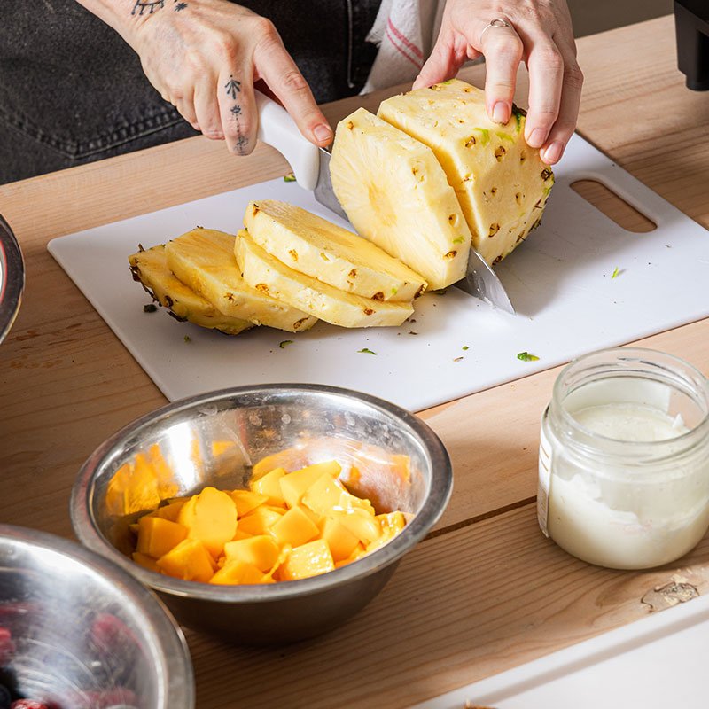
In collaboration with Shava Cueva, a series of photoshoots were conducted to display the product packaging against colourful backdrops inspired by the patterned tablecloths featured on many Mexican dining tables.


Success Story
Mandy started Lakitos as an idea in early 2023. 12 months later she’s running a successful business with a full product line, fresh branding, a unique name and heaps of content. She now has orders coming in faster than she can keep up with, has hired her first employee and is being stocked in H-E-B, America’s 6th largest private company!