

COMÚN
In March 2020, Oaxaca City (along with the rest of the world) went into lockdown due to the COVID-19 pandemic. Quarantine forced many local businesses to create new, innovative offerings for their customers to maintain cash flow while keeping everyone safe. I paired up with local cafe Filemón to create their adapted offering: COMÚN.
-
Sustainability was always at the heart of COMÚN's objectives. It was not only the answer to keeping a local business afloat during an unprecedented time, but it was also a way for local people to continue to have access to fresh, clean, and safe meals and produce at a time when it was otherwise difficult to acquire.
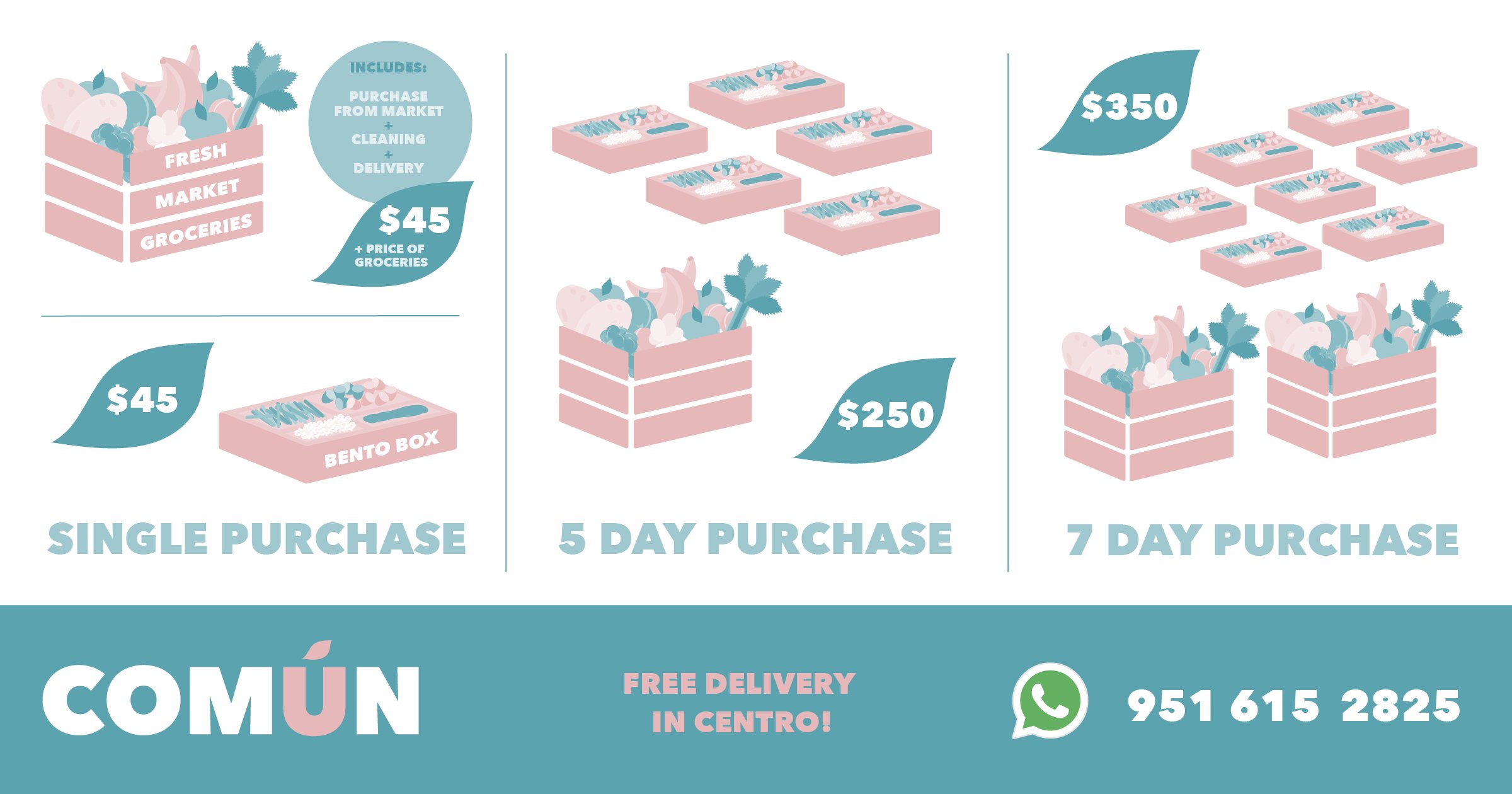
Using disinfected recycled crates and clean paper bags, the COMÚN team was considerate and thorough in their secure, minimal-contact grocery collection and drop-offs to their community in need during the pandemic.
-
☞ Naming
☞ Brand Strategy
☞ Brand Positioning
☞ Logo Design
☞ Visual Identity
☞ Verbal Identity
☞ Brand Guidelines
☞ Illustration
☞ Copywriting
☞ Digital Design
☞ Social Content -
☞ David Vallejo Photography
-
"From the moment we sought the professional help of Jess, we knew that no one could have understood us better than her. Her support and way of visualising things were incredible; she immersed herself in our needs and helped us create a creative, direct and honest personality for the project. Without a doubt, we would not have been able to survive the pandemic without her!" - David García, Founder of COMÚN

Project Objectives
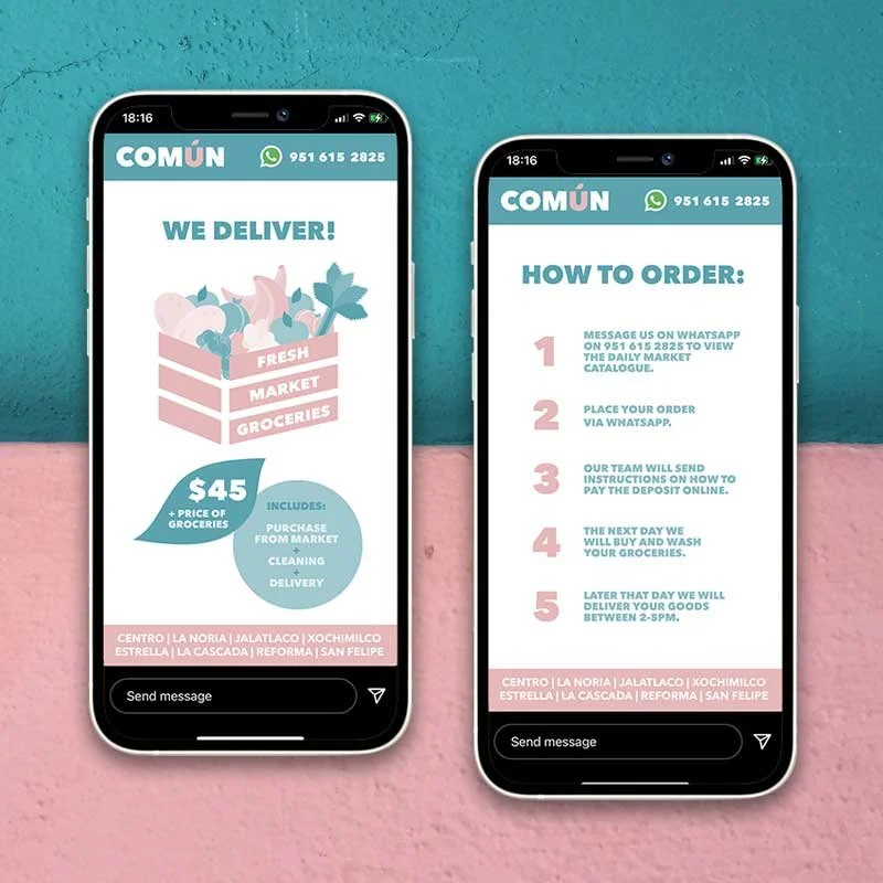
Local cafe owner David enlisted my help to name, design, launch, and market his affordable and safe grocery and food-delivery service in English and Spanish to local and expat audiences online.
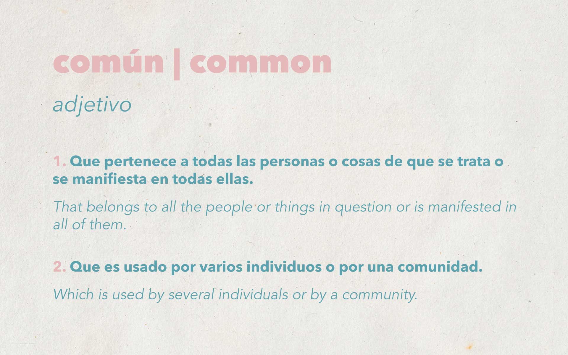
Naming
The service needed a name that bound people together during stress and uncertainty. In Spanish, the direct translation of común is "common". We landed on this name by exploring ideas of community — a concept that reflected what we all needed while being isolated.

Brand Strategy
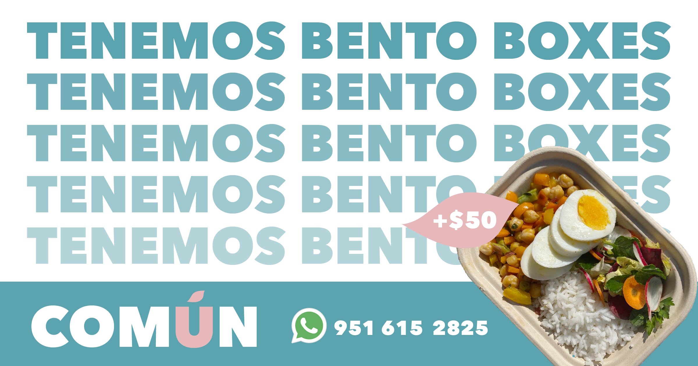
With plenty of delivery service competitors entering the market, COMÚN had to stand out. Most services targeted Spanish-speaking locals, opening a spot to consider the English-speaking community. So I tailored the message to those who couldn't navigate the city as easily as those who spoke the native language and had lived here for years. I created highly visual, easy-to-understand artwork designed for consumption on phones and communicated in Spanish and English.
CUSTOMER ARCHETYPE
The Safety-Concerned Innocent
POSITIONING
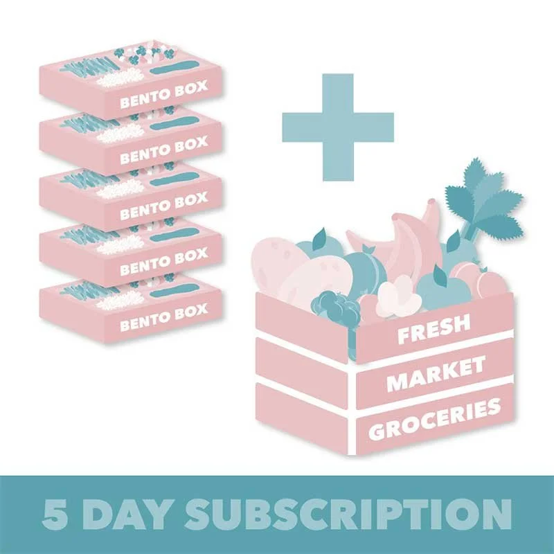
COMÚN delivers affordable, nutritious meals and fresh seasonal produce to local Oaxacans and ex-pats during the lockdown period in a sanitary and friendly manner.
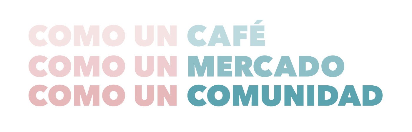
TAGLINE
Como un: café, mercado, comunidad
(Like a: cafe, market, community)

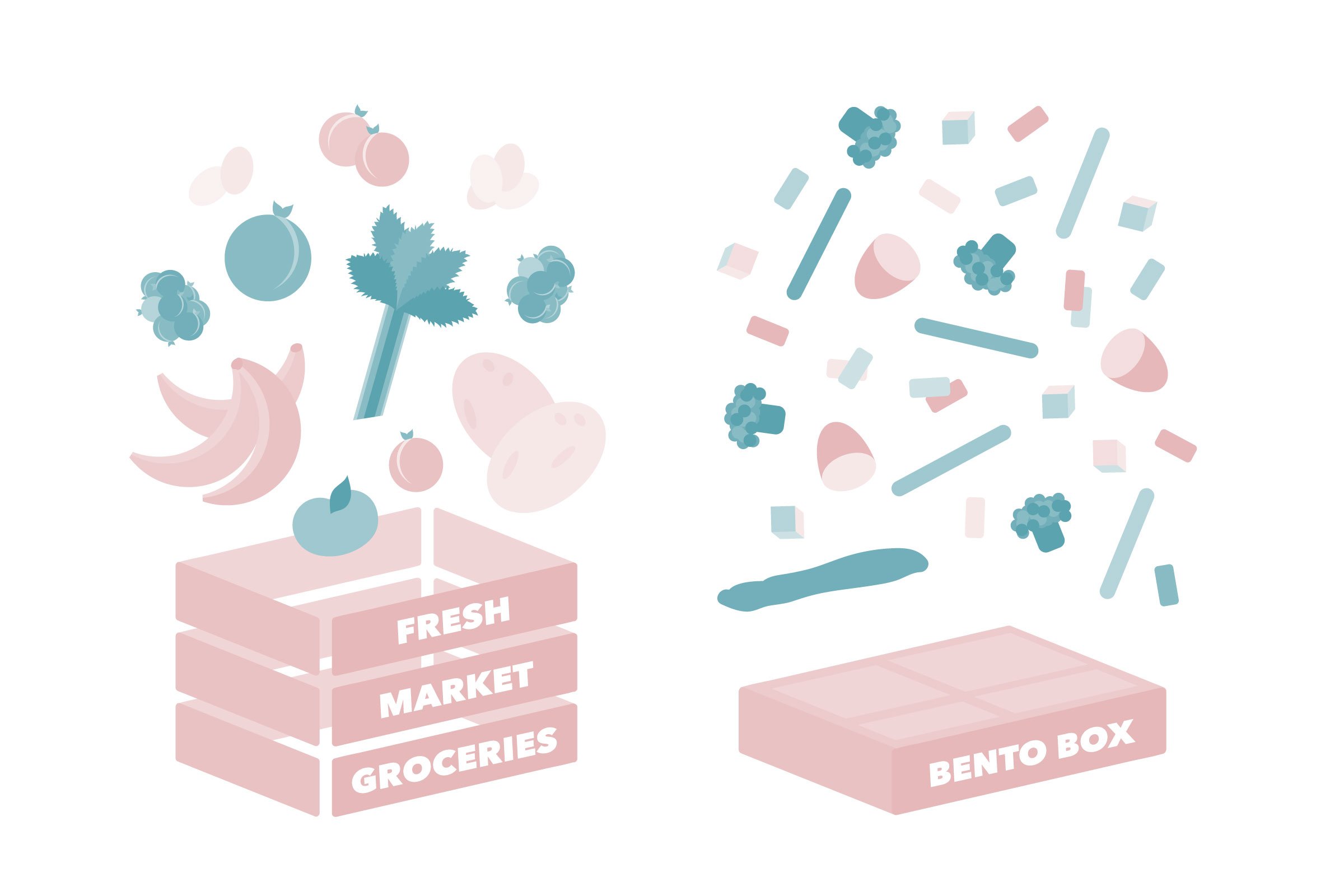
Visual Identity
The colour palette was inspired by the Walls of Oaxaca, which represent fresh, colourful, nutritious food. The logo incorporated a subtle leaf in place of the typical accent over the U, which was used as a brand icon for social media profiles.
Vibrant, fun illustrations were added to the mix to encourage feelings of positivity and hope during unprecedented times. The creative assets were used flexibly across social media platforms, Facebook, Instagram and WhatsApp.